When it comes to designing a Learning Management System (LMS), most people focus on function:
Is it fast? Is it reliable? Are the tools easy to use?
What’s often overlooked is the emotional experience a learner has while using the platform. Subtle elements like color schemes, tone of language, layout, and visual feedback play a powerful psychological role.
This is where emotional design comes in. Let’s explore how emotional design influences learner behavior and how LMS platforms can use it to dramatically boost engagement and retention.
What Is Emotional Design?
Emotional design is a user experience (UX) strategy that focuses on creating positive emotional responses in users through thoughtful choices in visuals, language, layout, and interactive elements.
In the context of an LMS (Learning Management System), emotional design helps shape how learners feel when they interact with the platform, not just what they do.
Definition:
Emotional design is the intentional use of design elements (like color, typography, micro-interactions, and tone of voice) to evoke specific emotional reactions, such as motivation, trust, clarity, or confidence, during a user’s experience.
Don Norman’s Three Levels of Emotional Design
Renowned usability expert Don Norman introduced the idea that people emotionally respond to products on three levels: Visceral, Behavioral, and Reflective.
Understanding these levels is key to designing an LMS that not only works well, but also feels good to use.
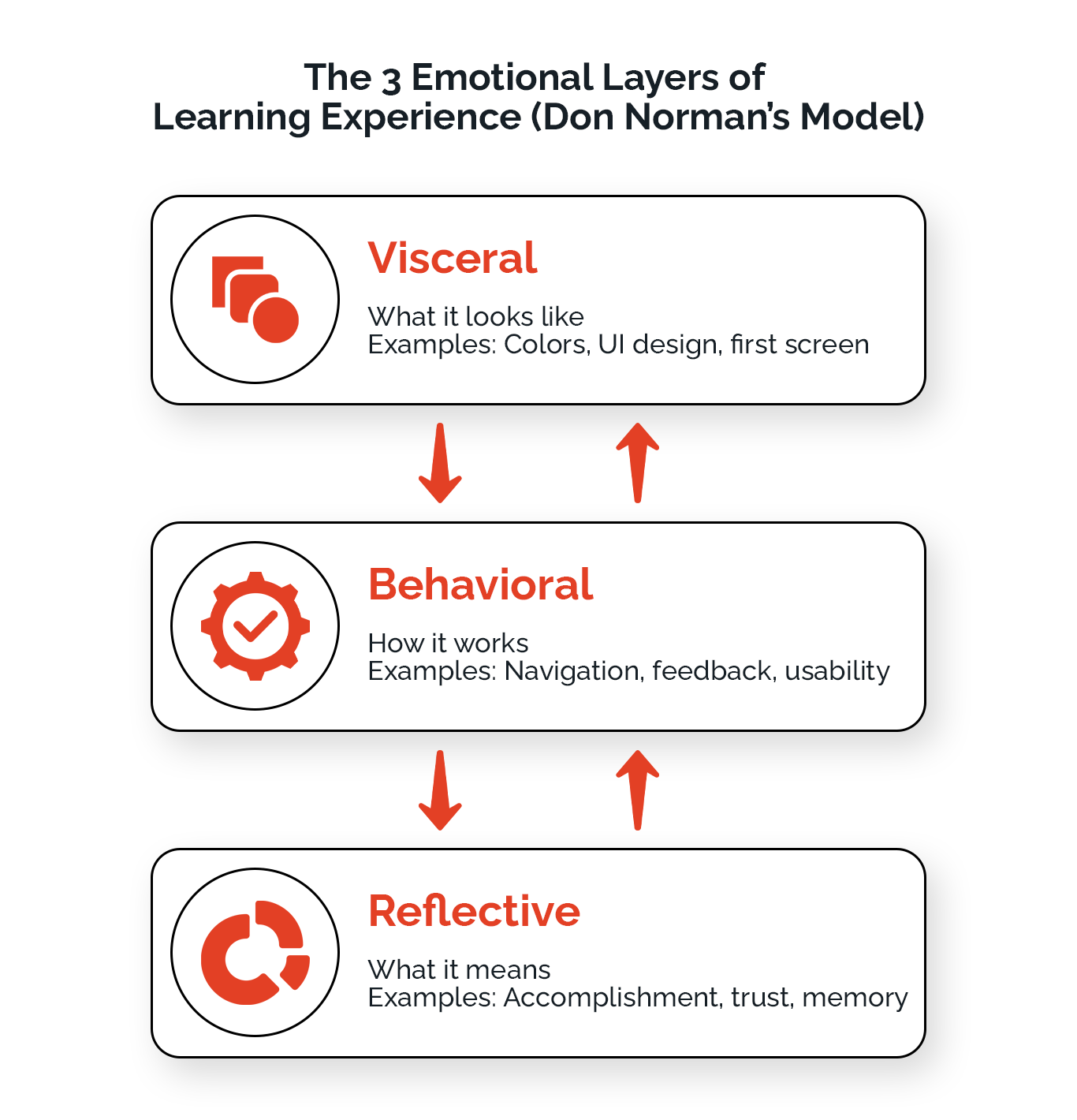
Let’s explore what each level means and how it applies directly to LMS platforms:
1. Visceral Level: The First Impression
This is the learner’s immediate emotional reaction to the LMS interface, what they see and feel within seconds.
What influences it?
- Colors
- Typography
- Imagery
- Layout aesthetics
- Motion/animation
In an LMS:
- A clean, modern design gives a sense of professionalism
- Soft, inviting colors can make learners feel relaxed and open to learning
- Overwhelming visuals or clutter can instantly cause anxiety or confusion
How to Optimize: Use a consistent color palette, calm visual hierarchy, and clean UI to create a welcoming first impression.
2. Behavioral Level: The Experience of Using the LMS
This is how learners feel while interacting with the LMS. It’s all about usability, feedback, and clarity during use.
What influences it?
- Navigation ease
- Button placement
- Loading speed
- Micro-interactions
- Feedback (e.g., “Well done!” or progress bars)
In an LMS:
- Learners feel motivated when the course flow is smooth and predictable
- Clear next steps and friendly feedback help reduce frustration
- Poor UX (e.g., confusing menus or hard-to-find content) leads to drop-off
How to Optimize: Use intuitive navigation, friendly prompts, and instant feedback to maintain user confidence and motivation.
3. Reflective Level: The Afterthought
This is the long-term emotional response learners have after using the LMS, and how they remember the experience.
What influences it?
- Sense of accomplishment
- Perceived learning value
- Trust in the platform
- Feeling of growth or progress
In an LMS:
- Completing a course and receiving a badge or certificate can evoke pride
- Learners are more likely to return if they associate the platform with achievement and clarity
- A confusing or cold experience may lead to negative associations and drop-off
How to Optimize: Design with clear milestones, visible progress, certificates, and friendly messages that foster a sense of growth and satisfaction.
The Psychology Behind Emotional UX
Humans don’t make decisions based on logic alone; we respond to how things make us feel. This is especially true in digital experiences, including Learning Management Systems (LMS). When a learner logs into an LMS, their emotional response to the interface plays a major role in whether they stay engaged or drop off.
Even before the content begins, a learner subconsciously evaluates the platform based on three key factors:
Color Psychology
Colors impact emotions.
- Calming blues or greens can improve focus and reduce anxiety
- Harsh reds or too much visual clutter can create tension or distraction
Tone of Language
The words used across the platform, tooltips, notifications, and feedback can shape the learner’s mindset.
- Friendly, encouraging language builds confidence
- Cold, robotic messages can make users feel judged or unsupported
Layout & Flow
How easy is it to navigate? How intuitive is the learning path?
- A clear, well-organized layout gives learners a sense of control
- Confusing menus or too many clicks can overwhelm and frustrate
Emotionally intelligent design makes learners feel more comfortable, confident, and motivated, ultimately leading to higher course completion and engagement.
What McDonald’s Can Teach Us About Emotional Design in LMS
When McDonald’s first began in the 1940s, its focus was purely functionality: fast service, low prices, and consistent food. It was a place you went for a quick meal, not for comfort, experience, or emotion.
But over time, McDonald’s realized that in a crowded market, efficiency alone wasn’t enough. So, it evolved.
Then: Transactional
- Bright red and yellow color schemes to encourage quick turnover
- Basic, utilitarian seating
- Advertising focused on price and speed
Now: Emotionally Driven
- Warmer interior colors and modern decor to make diners feel relaxed
- Self-service kiosks designed for ease and confidence
- Campaigns like “I’m Lovin’ It” that center around joy, memories, and connection
- Focus on family, familiarity, and comfort as emotional touchpoints
The LMS Parallel: From Tools to Experiences
Early LMS platforms were like early McDonald’s: built for function. They delivered content, tracked progress, and provided access. But they often ignored how learners felt while using them.
Today, just like McDonald’s, LMS platforms must evolve:
- From cold dashboards to warm, intuitive learning environments
- From rigid systems to emotionally engaging experiences
- From “just getting the job done” to creating lasting impressions
An LMS that feels encouraging, clear, and rewarding keeps learners coming back, just like a McDonald’s that feels comfortable keeps customers loyal.
Just as McDonald’s moved from fast food to feel-good food, LMS platforms must move from functional to emotionally intelligent if they want to stand out and improve learner retention.
7 Must-Have Emotional Design Elements to Make Your LMS Learner-Friendly
A successful Learning Management System (LMS) doesn’t just deliver content; it shapes how learners feel while engaging with that content. Emotional design goes beyond visual appeal. It’s about creating an environment where learners feel motivated, safe, and supported throughout their journey.
Below are 7 must-have emotional design elements that help improve learner satisfaction, engagement, and retention.
#1 Color Psychology
Design with Emotion in Mind
Colors aren’t just decorative; they influence how learners feel and perform.
- Blue = Calm, trustworthy (great for menus and dashboards)
- Green = Clarity, growth (ideal for progress tracking)
- Orange/Yellow = Optimism, energy (works well in CTAs and gamified tasks)
- Red = Alert or urgency (best used sparingly for warnings)
Stick to a consistent, calming color palette to create visual trust and reduce distractions.
#2 Emotionally Intelligent Language
Speak Like a Mentor, Not a Machine
Words matter. The tone of your LMS can inspire confidence or increase anxiety.
Use:
- Positive microcopy: “Great job!”
- Encouraging phrasing: “Almost there—keep going!”
- Friendly feedback: “Let’s review this together.”
Avoid:
- Robotic or critical phrases like “You failed this quiz.”
Write like a supportive teacher, empathetic, clear, and calm.
#3 Layout & Flow
Reduce Friction, Boost Confidence
A cluttered LMS overwhelms learners. Clean, thoughtful design creates a safe and easy-to-navigate space.
- Break content into digestible chunks
- Use clear progress indicators
- Add visual cues (icons, animations, tooltips)
- Use micro-interactions (e.g., a subtle checkmark for completed steps)
Keep important actions like “Start Lesson” visible and surrounded by whitespace.
#4 Micro-Interactions & Animations
Make Learning Feel Alive
Tiny visual touches can bring joy and clarity to the experience.
- Confetti or progress bar animations = sense of reward
- Loading spinners = reduced frustration
- Hover effects = make the platform feel intuitive and responsive
Use animations to celebrate success and guide users, not distract them.
#5 Emotional Accessibility
Include Every Learner
Neurodivergent learners or those prone to anxiety may find traditional interfaces overwhelming. Emotional UX can support them by offering:
- Calmer layouts with neutral tones
- Customizations: dark mode, font sizes, reduced animation
- “Focus mode” to eliminate visual noise
Accessibility isn’t just technical, it’s emotional. Help everyone feel at ease.
#6 Mobile-First Emotional Design
Design for the Small Screen with Big Impact
With more learners accessing courses on mobile, emotional design needs to translate to smaller interfaces.
- Easy touch-based controls (swipe, tap)
- Clean layouts with minimal clutter
- Feedback cues (color changes, subtle vibrations)
Prioritize simplicity and flow over feature-packed screens.
#7 Real-World Inspiration
How Top Brands Use Emotional Design
Many successful platforms have evolved emotionally, not just functionally.
🔹 McDonald’s
From fast food to a feel-good brand, now designed around family, comfort, and emotional connection. LMS platforms should follow suit: move from just “working” to feeling right.
🔹 Duolingo
Uses gamification, friendly characters, and playful feedback to make mistakes feel okay, perfect emotional design for learners.
🔹 Airbnb
Shifted from a booking site to a brand of belonging and trust, using clean visuals, warm copy, and personalization. LMS platforms can apply similar cues for learner trust.
Study emotional UX leaders, even outside of education. Great design is universal.
Conclusion
At its core, emotional design is about putting people first. While features, functionality, and performance are crucial, they’re not what learners remember most. What truly sticks is how your platform makes them feel, motivated, supported, curious, or confident.
By applying the 7 emotional design principles we explored, you’re not just improving UX. You’re creating a learning journey that connects, inspires, and lasts.
Because great LMS platforms don’t just deliver content.
They create emotional connections that drive learning forward.


